Interactive Maps With JavaScript

Saturday, September 19, 2020
Interactive Maps With JavaScript
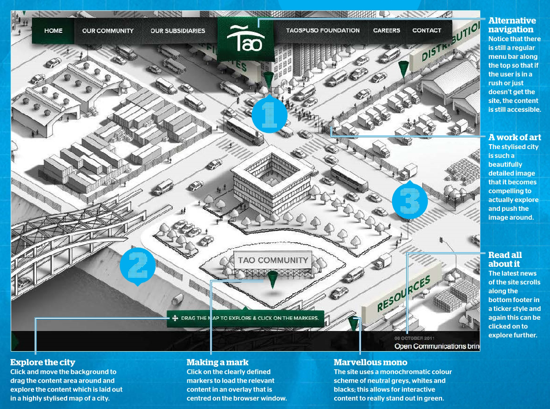
Going beyond standard web design: To make your site really stand out requires you to go beyond standard design procedures and make your contently with interactive features. Adding features that allow your users to explore the content will create a unique and memorable experience; the key to this is making sure these features enhance the content.


Inspiration: www.taocommunity.com

Creating the experience: “Tao Community is a group of companies that boosts communal relations at its core. What better way of showing this than through an interactive map that reflects what they do? We challenge ourselves to create an experience and, at the same time, make it easy enough for the audience to know what Tao is all about. We wanted the map in greyscale so that we can focus more on the detail without overwhelming the user.”

With the steady rise of sites looking for rich media experiences without the use of Flash – especially in the light of the recent announcements from Adobe – JavaScript has become an increasingly important power source for these experiences. The Tao Community provides a huge map to explore that can be dragged with several clickable elements; these then load relevant content to the centre of the screen. Once this would have doubtlessly been the reserve of Flash, but with HTML supporting ever richer experiences, plug-ins can now be left behind. JavaScript is used here to grab the width and height of the window and make the image full screen, and then power the dragging functionality.

#1 - INSPIRATION: Illustration style
Some of the best sites have extremely stylised content and it’s usually this element alone that makes a site stand out from its rivals. When implementing a unique navigation system that involves exploring a map, the perfect solution is to have a stylised image. In this particular case the map is created like an illustration with a monochromatic colour scheme. This allows for the links to stand out against the background. It’s also worth noting that the links have all been placed towards the centre so the user doesn’t have to develop a repetitive strain injury in order to find the actual content!

#2 - TECHNIQUE: Draggable areas with JavaScript
STEP 1: Get The Library
There are a number of JavaScript libraries that offer the ability to create draggable content within a div area. The simplest that we found can be downloaded from www.switchonthecode.com/tutorials/javascripttutorial-draggable-view-in-a-container, but feel free to shop around for one that works best for you. Once downloaded link to it in the head section of the JavaScript with the code shown below.

CODE:
<script type="text/javascript" src="SOTC-Draggable_View_Example.js">
</script>

STEP 2: Let's Create The Draggable Content
Here we create a div that will have a 1-pixel solid black line around the edge of the div area. In this case, the div is set to be 1,000 pixels wide by 600 pixels high – however, you can change the size of this div tag to whatever scale is necessary for your content. Notice how the overflow is hidden because the image needs to be masked by the div area.

CODE:
<div id="containerBox" style="position:relative; border:1px solid black;width:1000px;
height:600px; overflow:hidden;" >

Click and Drag
Click and Drag: Clicking on the image allows it to be panned around by dragging with the mouse. This enables you to create interactive draggable content for your users similar to that found on the impressive Tao Community website.


STEP 3: Add An Image
Now we add this image inside the ‘containerBox’ div tag. Note that we have to use an image which is larger than the div area, otherwise it won’t be able to be dragged around when it’s clicked on. As you can see in the code, we’ve used an image here which is more than double the width and height of the div tag; this suits our purposes down to the ground.

CODE:
<img id="draggableElement" src="images/largepicture.jpg"
style="width:2530px; height:1688px; position:absolute;
top:-333px;left:-500px; cursor:move;" />
</div>

STEP 4: Add The JavaScript
The following JavaScript code can be added to the body area of the document. Here we store the element to be dragged in the variable ‘el’. At this stage, we also get the parent node, which is the surrounding div area. Finally from this area, we store the left-hand edge of the div tag.

CODE:
<script type="text/javascript">
var el = document.getElementById('draggableElement');
var parent = el.parentNode;
var leftEdge = parent.clientWidth - el.clientWidth;

STEP 5: Wrap Up The Code
The next variable that we add takes the top edge position of the draggable area. The final line of code below just sets this up to be the draggable object. All the real power is done in the library that we linked back in step 1. All you need to do now is save the document and preview in your web browser to check everything is working as it should. And there you have it; now your users can click and drag to their hearts’ content!

CODE:
var topEdge = parent.clientHeight - el.clientHeight;
var dragObj = new dragObject(el, null, new Position(leftEdge, topEdge), new Position(0, 0));
</script>

#3 - TECHNIQUE: Create Line-Art Images
Without a doubt, one of the coolest parts of the Tao Community website is the amazing artwork of the city. This is a time-intensive job that can be achieved by tracing a photo using Photoshop.

STEP 1: On The Right Path…
In the Paths, panel add a new path and switch to the Pen tool. Click on the outside of the buildings to trace the edges. If you need to deselect a path to start a new one, switch to the Direct Selection tool and click on the document, then switch back.
STEP 1: On The Right Path…


STEP 2: Stroke and Fill
Back in the Paths panel, click on "path 1" and hit the second icon from the left at the bottom which will stroke the path with the paintbrush. Choose a light grey colour and start adding shading to various parts of the image to create a sense of depth.
STEP 2: Stroke and Fill


STEP 3: Add A New Layer
Create a new layer and use the Paint Bucket tool with a white foreground colour to fill the canvas with white. Next, add another layer and switch to the Brush tool. Choose a 2-pixel-sized brush and select black as the foreground colour.
STEP 3: Add A New Layer

Interactive Maps With JavaScript Interactive Maps With JavaScript Reviewed by Kamal Thakur on Saturday, September 19, 2020 Rating: 5

Digital First For DuJour Magazine

Saturday, September 19, 2020
Digital First For DuJour Magazine
The Visual Web: Visual content is placed at the forefront of this online magazine, to keep the presence extremely similar to the print edition of the magazine. This shows how far the web has come as a design medium, with rich magazine design becoming more easily created for the web.


One Page Wonder: “The print emulation of this website’s design is created to be as easy-to-read as possible, so there is really only one way to read and that is to scroll down through the content, like you would read through a magazine. Being a digital version, there is a handy inclusion of a contents page that can enable the reader to jump to any spread of pages.”

Earlier this year, Jason Binn decided to create a new luxury, lifestyle, and fashion website to showcase DuJour magazine (www.dujour.com). To do this, he combined print magazine design quality, with an adaptive web publishing model.

To accomplish this feat, Binn approached Code and Theory to develop a digital experience that could function flawlessly on desktops and tablets alike, while showcasing ongoing editorial updates and the full run of current issues.

Working side-by-side they embarked on designing a full digital experience on the web as the irst print issue of DuJour was being created. To do this well, simplicity was key. The online magazine exists as one long scrolling page with the relevant content loaded at the appropriate time.

#1 - INSPIRATION: Unified Publishing
Rather than creating separate experiences for the print and digital magazine, iPad, and website, Code and Theory developed a single-view site that houses editorial, advertising, and photo galleries. To ensure navigating the site was a seamless experience, Code and Theory designed an infinite scroll format that allowed for undisrupted exploration and keeps users on the same single webpage. Users can browse through photo stories, dive deep into editorial content or just scroll through highlighted stories one after another. Each individual piece of content is shareable to a variety of social media through deep links.

#2 - TECHNIQUE: Sliding Side Panel
STEP 1: Create The Panel
Create a new HTML page, and in the body, section add the div tags as shown below. This is the panel that will slide in from the side and the switch that will be pressed to make the panel slide in and out from the right-hand edge. The switch has a less-than symbol displayed as an arrow, but you could use an image icon.

CODE:
<div id="panel">Panel</div>
<div id="switch">&lt;</div>

STEP 2: Style The Document
Move up to the head section of the document and add the link to jQuery and the style tag. Add the CSS rule for the body and HTML that sets the margin and padding to 0, with the height of the document set to 100% which enables the panel to also be 100%. The overlow is set to hidden to avoid having horizontal scroll bars.

CODE:
<script src="http://code.jquery.com/jquery-latest.min.js"></script>
<style type="text/css">
body, html {
margin: 0; padding: 0;height: 100%; overflow: hidden;
}

STEP 3: Style The Document (2)
Continue styling the page by making the panel a mid grey colour, it will be the full height of the browser and 400px wide. The position will be o the screen to the right. The switch that controls the sliding panel is made to have a yellow background and also positioned to the right, but halfway down the document.

CODE:
#panel {
background-color: #999; width:400px;
height: 100%; position:absolute;
top: 0; right: -400px;
}
#switch {
background-color: #FF0; position:absolute;
top: 50%; right: 0;
cursor: pointer;
}

STEP 4: Add The jQuery
Still in the head section, add the script tag and the remaining jQuery code – this adds a variable that tells us whether the side panel is on the screen or not. The document-ready function allows jQuery to add a click function to the switch when it loads. If the on-screen variable is true then the panel is slid of to the right.

CODE:
<script>
var onScreen = false;
$(document).ready(function() {
$("#switch").click(function() {
if (onScreen){
$("#panel").animate({'right':'-400'},'easeOutSine');
$('#switch').text('<');
onScreen = false;
}

STEP 5: Add To Your CSS
If the panel is not on the screen it is slid on, using this code. Notice that the text in the switch div tag is changed to a greater-than symbol (>). This shows that the switch now controls the side panel to slide back out. Save this and test it in the browser to see the sliding side panel on the right of the screen.

CODE:
else {
$("#panel").animate({'right':'0'}, 'easeOutSine');
$('#switch').text('>');
onScreen = true;
}
});
});

#3 - TECHNIQUE: Recreating The Logo
The online magazine uses a classic title-based logo, often seen in print, and here we show you how to leverage the power of Illustrator to recreate the logo by manipulating the letterforms.

STEP 1: Add The Text
Open Adobe Illustrator or a similar tool and use the Text tool to add the title as shown. We’ve used Bodoni as the typeface and changed the ‘Jour’ part to bold, so there is a slight difference in the emphasis.
STEP 1: Add The Text


STEP 2: Convert To Paths
Select the text, and from the type, the menu chooses to Create Outlines. The text is not editable as text now but editable as a vector shape. Switch to the direct selection tool, which is the white pointer tool, ready to manipulate the text.
STEP 2: Convert To Paths


STEP 3: Manipulate The Letter
Click and drag around the bottom half of the letter J. Now click and move this down and to the right to create the letter as shown in the screenshot. You can also move the letter closer to the others after you have finished manipulating it.
STEP 3: Manipulate The Letter

Digital First For DuJour Magazine Digital First For DuJour Magazine Reviewed by Kamal Thakur on Saturday, September 19, 2020 Rating: 5

Apply Transparency Effects In Photoshop

Saturday, September 19, 2020
 
Apply Transparency Effects In Photoshop
Going in circles cultural solutions uk wanted to create an illusion of endless possibilities. The circular inspiration came from the identity, which used overlapping circles and overlays. They liked the use of parallax at the time, most notably at www.nikebetterworld.com.


Transparent styles are rife in contemporary web design and, with new option upgrades in Internet Explorer and CSS, Photoshop artists are excelling in creating what are described as ‘faux-transparency assets’. Basically what this means is that Photoshop is being employed to create solutions without the need of data encoding, but rather to make solid images.

This is all thanks to the adoption of PNG-based files, which are now easy to apply with the Save for Web & Devices option. Here web designers can simply select PNG24 from the preset options, with Transparency ticked for sure-fire results. The effect looks just as seethrough to the end-user and sidesteps tricky issues with poor browser support and having to hack IE6.

David Lambert’s site (www.culturalsolutions.co.uk by Hoohaa Design) uses this style to great effect. He explains: “Web design is becoming a lot more fluid, aiming to engage the user this way. Websites are focusing more on experience rather than just providing well-organised content. Transparency effects have also become a lot more popular because PNGs are now well supported by most browsers.”

The site is targeted at the arts and culture sector so it had to make a statement. Lambert adds: “We aimed to make the site into a memorable experience for the user, with the aim to create a grown-up but creative feel.”

Parallax Effects:
“JavaScript-powered interactive elements help enrich and add depth to the visuals. The parallax motion of the circles at the top surprises the user, inviting them to explore. As the user moves down the page the parallax effect creates a fluid-almost-visceral feel. The various circle elements and jQuery-powered sliders are used to structure the content in a logical manner.”

#1 - Technique: Transparent Web 2.0 elements
Transparent icons and panels instantly make a website look modern and cool. One thing to always remember, however, is that you need a suitable backdrop to maximise this effect – so anything such as mosaic pixel patterns, strobe or bokeh lighting will really enhance your results. Here we show you how to create a transparent panel in just three steps using Photoshop, and how it’s affected by using one of the mentioned backdrops.

STEP 1: Cut Some Shapes
First select the Rounded Rectangle tool and draw out your shape. Set the Radius settings to between 10 and 40 pixels depending on your panel size. Next, select the Inner Glow layer style from the menu in the Layers palette.
STEP 1: Cut Some Shapes


STEP 2: Layer Style Options
Set Blend Mode to Normal, Opacity to 100% and the colour to #666666. In the same menu set a 1px black Outside Stroke. Cmd/Ctrl-click the shape mask thumbnail, select the Marquee tool and move your selection up half of the shape.
STEP 2: Layer Style Options


STEP 3: Gloss Effects
With a white foreground colour, apply a foreground-to-transparent gradient at around 30% Opacity. Cmd/Ctrl-click your shape mask thumbnail, applying a layer mask to this gradient layer. Lastly, drop both layers’ Opacity to 60%.
STEP 3: Gloss Effects


#2 - INSPIRATION: Why use PNG?
With updates in Internet Explorer, the PNG is finally matching the GIF, becoming extremely advantageous. The PNG firstly reduces file size without reducing image quality, making it better than its GIF and JPEG counterparts. PNG also supports 24-bit RGB or 32-bit RGBA colour palette-based images, meaning perfect translation of millions of colours. Most importantly, however, is that the PNG lets you work with alpha channels. This means whereas GIFs only allow a given pixel to be fully transparent or opaque, PNGs create images with degrees of transparency, better for blending images with their backgrounds.
#2 - INSPIRATION: Why use PNG?


#3 - TECHNIQUE: Blending Modes (for transparency)
STEP 1: Hard Light
This blending mode darkens shadows and brightens highlights, tinting everything beneath. Generally use Hard Light when you want to amplify the original hue and saturation to enrich tones.
STEP 1: Hard Light
STEP 1: Hard Light


STEP 2: Overlay
This affects the overlap similar to Hard Light. However, when your shape interacts with the background, its tone looks to match hues. In black or white backgrounds it tends to disappear.
STEP 2: Overlay
STEP 2: Overlay


STEP 3: Difference
This mode throws up surprises and can quickly alternate tones creating visual interest. It works by inverting tones in the overlapped layer. Hues become their opposite on the colour wheel, eg here green becomes magenta.
STEP 3: Difference
STEP 3: Difference

Apply Transparency Effects In Photoshop Apply Transparency Effects In Photoshop Reviewed by Kamal Thakur on Saturday, September 19, 2020 Rating: 5

Master Retro Looks With Photoshop

Friday, September 18, 2020
Master Retro Looks With Photoshop
Retro looks: Type, bitmap textures, and colour combine to give this site the complete retro look. The visual outcome is something that offers a sense of history and unique character.


Retro styles have gripped the digital design world, dominating other trends across the discipline. In previous issues of Web Designer we've looked at the reasons behind this trend, but here we’re showing you how to master some of the most useful Photoshop tools to produce your own stunning styles.

We'll be exploring how to create digital textures to replicate real-world examples using the Photoshop Pattern Fill layer style. We’ll also reveal how you can create grain effects using Photoshop brushes and blending modes, all inspired by the designs at www.castirondesign.com. This is a great example of not just the application of effects, but also the use of vintage typography to produce a recognizably old-school look.

We'll also look at ways you can use Photoshop Actions, which we have treated you to a selection of on our resource disc. Enjoy!

#1 - INSPIRATION: Retro showcase at line25.com
Looking for inspiring examples online, for your retro web design projects? Look no further than line25.com. This site describes itself as a ‘drawing board of creative web design’ and its blog on 30 inspiring retro-style websites is a real delicacy. Our favourites presented include our very own www.castirondesign.com, as well as bitfoundry.ca and the wonderful thislandishovland.com.
#1 - INSPIRATION: Retro showcase at line25.com


#2 - RESOURCES: Using Retro Actions
Photoshop Actions are an extremely useful asset to have when creating vintage looks in your designs. These can be applied to all web elements – in particular, photographic images.

You can activate the Actions panel from the Window drop-down menu. From this panel select the lyaout options, choosing Load Action to add those supplied in the Retro Photo Actions pack to your presets. Just click the Play button to automate the effects. You can find tons of useful actions also online, available from content providers. www.deviantart.com is a real hotspot for this kind of thing. These work out cheaper than most plug-ins.
#2 - RESOURCES: Using Retro Actions


#3 - TECHNIQUE: Retro Textured Web Header
STEP 1: New Document
Open Photoshop and select File > New. Set Width at 1px, Height at 3px. Zoom in to your layer at 3,200% and select the Rectangle Marquee tool. Make a selection at the top of your layer covering 1px (a third) of your layer. Fill this with black (Shift+F5).

STEP 2: Save Pattern Preset
Deactivate your selection (Cmd/Ctrl+D) then select Edit > Define Pattern. Name this pattern ‘Retro texture horizontal’. Select Image > Image Rotation > 90 degrees CCW. Once more, select Edit > Define Pattern, saving as ‘Retro texture vertical’. Now you have effectively created the building blocks for a retro texture in Photoshop, applicable from your Layer Style options.

STEP 3: Apply Pattern Preset
Select File > New, setting Width at 1,536px, Height at 2,048px. Add a #B6AC95 colour to your background. Draw out your header backdrop using the Rectangle shape tool. We’ve used a #D1C4AA colour. Now activate the Layer Style options (fx) from the foot of the Layers Panel and Pattern Overlay.

STEP 4: Add Noise Texture
We’ve applied the Retro texture vertical pattern at 8% Opacity. Next, create a white web header shape and apply Filter > Noise > Add Noise. Set your Amount between 25% and 30%, activating Uniform and Monochromatic. Set the layer blending mode to Multiply, with Opacity at 25 & 30%.

STEP 5: Add a Scatter Brush
Create a new layer, blending mode set to Dissolve, Opacity 1% and Fill 10%. Select the Brush tool. Set Brush Size at 2,500px and Hardness at 0%. Press F5 and activate the Brush Tip Shape options. Set Spacing at 1,000%. Deactivate all other option sets. Click your brush once on your new layer.

STEP 6: Final Layer Styles
Duplicate, invert (Cmd/Ctrl+I), resize and reposition your duplicate layer. You can now merge these two layers and edit the strength of the effect through layer opacity values. Finally, add a subtle Drop Shadow layer style to your header shape to create the illusion of 3D; set Opacity at 20%, Size 20px.

Master Retro Looks With Photoshop Master Retro Looks With Photoshop Reviewed by Kamal Thakur on Friday, September 18, 2020 Rating: 5

Scrolling Backgrounds With An Animated Twist

Friday, September 18, 2020
 
Scrolling Backgrounds With An Animated Twist
Tone It Down: Reducing the colour in the background achieves two things. Firstly it cuts down on data so an image can be compressed further. Secondly, it allows the main content to be read much more clearly over the top without the backdrop muscling in on the foreground.


“The moving image in the background of the Diva website works so successfully because the user isn’t accustomed to the background changing too much. In order to improve user experience think about how visitors interact with your site and what might be altered to give your users a more memorable experience – this is certain to drive traffic.”

Inspiration: www.divabymakole.at

There are so many examples of websites out there that have a good design, but not always a boundary-pushing user experience.

Occasionally, though, you will come across a website that offers a real wow factor as you explore it, providing some form of graphical awesomeness out of the blue.

When good design and interactivity are brought together you get a very memorable site. The Diva website has an incredibly simple design on first impressions. There’s a model in the background and the content is deliberately placed towards the bottom of the screen inviting you to scroll. As the user moves down the page, however, the background image comes alive as a sequence of images reveals the model getting dressed, with the content sliding over the top. All in all, it makes for a fun and unexpected experience.

#1 - INSPIRATION: Simplicity Is Key
So often a website will try and cram far too much detail in, with sidebars and content all over the place. The Diva website keeps its content relatively simple, in a single column for the majority of the page. This enhances the background image content and makes it easy to scale for smaller devices. The design has suitably been thought through when moving to tablet-style displays, as the menu moves from the side to the top. Again, when moving to a smaller phone-sized display, the background image becomes fixed saving the browser the extra workload of dealing with those images.

#2 - TECHNIQUE: Scroll-Driven Animated Images
STEP 1: Start The Document
Open a new HTML document and add the code below into the head section. This links up to the jQuery library and establishes the main structure of the page.

CODE:
<script src="http://code.jquery.com/jquery-1.7.2.min.js"></script>
<style type="text/css">
body{
margin: 0;
height: 1800px;
min-height: 1800px;
padding: 0;

STEP 2: Complete The CSS
In the head continue adding the CSS as shown. This styles the image swap div area and allows it to fill the full screen. We create a fixed class that we add with jQuery then we add a class for each image. Continue adding classes for 3 and 4; these will be the same as 2 but with a higher z-index, positioning images correctly.

CODE:
imageSwap{
position: fixed;
overflow:hidden;
top: 0px;
left: 0px; width:100%;
}
#imageSwap.fixed {
position: fixed;
top:0 px;
}
.1 {
position:absolute;
z-index:1;
}
.2 {
position:absolute;
display:none;
z-index:2;
}
</style>

STEP 3: Add The Body Content
Move to the body section now. The following code adds a div tag to the document that contains a series of images. The CSS turns the visibility of all the images of except for the topmost (image 1). Using jQuery we will activate the appropriate image as the user scrolls.

CODE:
<div id="imageSwap">
<img class="1" src="1.jpg" />
<img class="2" src="2.jpg" />
<img class="3" src="3.jpg" />
<img class="4" src="4.jpg" />

STEP 4: Add the jQuery
Now, underneath the div tag in the body section, add the following code which defines a JavaScript area and records the position of the scrolling. As the user moves down the document the scroll position is saved in the yPos variable. This then changes the position variable for every 300 pixels that are scrolled.

CODE:
<script language="javascript" type="text/javascript">
var thisPos=1;
var lastPos=1;
$(document).ready(function () {
$('#imageSwap').addClass('fixed');
$(window).scroll(function() {
var yPos = $(window).scrollTop();
if (yPos <= 300){
thisPos=1
}
if (yPos > 300 && yPos < 599){
thisPos=2;
}

STEP 5: Switch The Images
To give the illusion the background is moving, the images in the div tag are switched between. This is done by fading in the new position class and fading out the old position. The last position variable is updated after every scroll so we know where the user is in the document.

CODE:
if (yPos > 600 && yPos < 899){thisPos=3;
}
if (yPos > 900 ){
thisPos=4;
}
if(thisPos != lastPos){
$('.'+thisPos).fadeIn(10);
$('.'+lastPos).fadeOut(10);
}
lastPos=thisPos;
});
});

#3 - TECHNIQUE: Create Your Own Image Sequence
In order to create an image sequence background like Diva, you will need to set up a DSLR and capture your subject. Ideally, you would do this in a studio, but a well-lit room with a decent flash can work just as well.

STEP 1: Set Up The Shot
You need a steady shot so grab a camera and you will definitely need a tripod. If you haven’t got a floor-mounted tripod then a GoPro or mini tripod will suffice. Use a plain white sheet for the background.
STEP 1: Set Up The Shot
STEP 1: Set Up The Shot

STEP 2: Import into Photoshop
Once you have captured your subject bring the first image into Photoshop and add a new layer. Use a Radial gradient with the foreground set to white and the background set to black, then drag from the centre out to apply a vignette. Lastly, change this layer’s blend mode to Multiply.
STEP 2: Import into Photoshop
STEP 2: Import into Photoshop

STEP 3: Colour Tweaks
Press Cmd/Ctrl+U to call up the Hue/Saturation panel and drag the Saturation slider down to take some colour out of the image. Save the file and drag in the other shots, using this as a template.
STEP 3: Colour Tweaks
STEP 3: Colour Tweaks

Scrolling Backgrounds With An Animated Twist Scrolling Backgrounds With An Animated Twist Reviewed by Kamal Thakur on Friday, September 18, 2020 Rating: 5

Continuous Testing using Sismo

Sunday, August 30, 2020
Sismo is free and open source, and can be downloaded from the SensioLabs site.

"Learn how to easily test your PHP projects using SensioLabs’ excellent Sismo suite"

Testing code is something that every developer has to do to ensure a quality product on completion of a project. Most coders when they start testing just manually follow the procedure of the code and try to find where the issue is, possibly echoing out a few variables here and there. While this works fine sometimes, for larger projects or projects you have inherited from other developers it can be a time consuming and frustrating process. Thankfully there are lots of tools available to help simplify testing and to find bugs as soon as they are introduced. PHP is no different and has apps such as SimpleTest or PHPUnit. SensioLabs have been making waves with their modern Symfony2 framework and the associated modules, and recently released the Sismo testing suite. Sismo is a continuous testing server that is written in PHP but can integrate with any language. All you need to do is tell it what program you are using to test within the config file. This tutorial will show you how to test your PHP projects using Sismo, Git, and PHPUnit.

STEP 1: Download Sismo
To start off we need to download the Sismo software, which can be found at sismo.sensiolabs.org. Sismo is quite simply just one PHP file, but don’t be fooled, its a very powerful little tool. Place the file into the web directory of your project.

STEP 2: Install PEAR
You’ll also need to have the PEAR package manager installed if you don’t already. For Windows users, run the file shown from the search bar, for OS X and Linux users, you’ll need to run them from a terminal window. We need to do this, as this is how we will install PHPUnit, which is to be the testing software that we’ll use.

CODE:
Windows:
c:\php\go-pear.bat.

Linux:
$ wget http://pear.php.net/go-pear.phar
$ php go-pear.phar


OS X:
$ wget http://pear.php.net/go-pear.phar
$ php -d detect_unicode=0 go-pear.phar

Installation is done using the PEAR package manager, which is used for many other PHP libraries.

STEP 3: Install PHPUnit
Once you have PEAR set up its time to install PHPUnit. PHPUnit is one of the most popular unit testers for PHP and is a valuable tool to have. Back in the terminal, enter the commands below to start the installation.

CODE:
pear config-set auto_discover 1
pear install pear.phpunit.de/PHPUnit

STEP 4: Example Test For PHPUnit
When you write your tests for PHPUnit, you extend the main PHPUnit class and then place your test methods inside that. It’s normal to keep your tests in a separate folder for the rest of your app.

CODE:
require_once 'PHPUnit/Framework.php';
class ArrayTest extends PHPUnit_Framework_TestCase
{
}

STEP 5: Main Test Methods
If you are not used to unit testing, then now is a good time to take a look at how it works and why you really should do it. Unit testing means writing code that verifies the output of your main app code. You write tests for each section of your code until your entire project is covered. You can then run all the tests as one when implementing new features to quickly find bugs across the entire project.

CODE:
functiontestToString(){
{

STEP 6: Testing of Main Test Methods
When writing unit tests, you need to break each method down into goals. Here we simply confirm that the variable we are testing contains the string ‘This is my var’. If it does not, then the test fails.

CODE:
functiontestToString(){
$result=$this->myVar->toString('contains%s');
$expected='containsThis is my var';
$this->assertTrue($result==$expected);

STEP 7: Second Method
As another example of a unit test method, we can test that we have the correct amount of elements within an array by calling the assertCount method. This test would clearly fail, as we are asserting that we have 12 elements when we only have three within our array.

CODE:
public function testAmount()
{
$this->assertCount(12, array('myString' , 'anotherString' , 'etc'));
}

STEP 8: Test Out Sismo
We need to create a config file for Sismo to read from. As Sismo is one file, we have to make the directory and file contents ourselves. It’s easiest with Terminal. Navigate on the command line to the folder you placed Sismo in.

STEP 9: Create Config Directory
In Terminal enter the commands below. This creates our config directory and then a PHP config file that we will populate with our settings. Sismo is straightforward, but there are a few handy settings you can tweak.

CODE:
mkdir ~/.sismo
cd ~/.sismo
touch config.php

The main web interface is attractive, but most of the work can be done using just the console.

STEP 10: Start config.php
Now edit the config.php file to contain the settings with which we need to work. Start off by creating a new array called $projects, then we can add a notification system. Uncomment the notifier variable relevant to your OS.

CODE:
<?php
$projects = array();
For OS X use the Growl notification system on test end
$notifier = $notifier = new Sismo\Notifier\
GrowlNotifier('pa$$word');
For Linux, use Dbus notifications
$notifier = new Sismo\Notifier\DBusNotifier();

STEP 11: Add Your Git Repos
Sismo works with Git repositories, so you will need to have a local and GitHub hosted repo to get the most out of the testing suite. Replace the relevant values in the code below with your own repos.

CODE:
$projects[] = new Sismo\GithubProject
('myLocalProject', '/Users/kiksy/myProj', $notifier);
$projects[] = new Sismo\GithubProject
('myProj', 'kiksy/myProj', $notifier);

STEP 12: Project Settings
Then we need to add a new project to our Sismo object. Once we have done that we can set our remote repository location, this will be somewhere on github.com. The branch that you will need is the most likely master, but you can obviously get this to your own branch you’re working on.

CODE:
$myProj = new Sismo\Project('myProj');
$myProj->setRepository('https://github.com/kiksy/myProj.git');
$myProj->setBranch('master');

STEP 13: Remaining Project Settings
The last settings we need to add make up the command that will run to start your tests. As we are using PHPUnit, it links to the script to run that. You can switch this out though and change it for any testing software that you want to use for your specific language. Finally, we add the commit route and return our $project variable.

CODE:
$myProj->setCommand('./vendors.sh; phpunit');
$myProj->setSlug('symfony-local');
$myProj->setUrlPattern('https://github.com/kiksy/myProj/commit/%commit%');
$myProj->addNotifier($notifier);
$projects[] = $myProj;
return $projects;

STEP 14: Changing The Config File Location
As the config file is very specific for one project, and the default location is set to be within the root of the user directory, you may want to move it – perhaps to the bottom of the project directory. That way you can run multiple Sismo tests on the same machine for different projects. Simply run this command to do so:

CODE:
php sismo.php --config-file=.sismo/config.php

STEP 14: Changing The Config File Location

STEP 15: Run Sismo Test
Open the browser and go to localhost/myProj/sismo.php – you should then see the main Sismo report page. This is where the updates will come on the status of each test and whether or not they have passed. The actual running of the tests is done from the command line.

STEP 15: Run Sismo Test


STEP 16: Run Your Unit Test
The next thing we need to do is run our unit test and see the end result. Make sure you are in the correct directory within your project and then run the command below. In your browser you should then see the results of the test.

CODE:
php sismo.php build

STEP 17: Possible Issues
While Sismo is fairly easy to set up, it is possible to come into some problems. Even if you don’t use it, Sismo is dependent on SQLite3, and so this needs to be installed before Sismo will successfully run. While OS X mostly comes installed with SQLite, some of the Linux flavors don’t. Run the below to start the installation.

CODE:
sudo apt-get install php5-cli php5-dev make
sudo apt-get install libsqlite3-0 libsqlite3-dev
sudo apt-get install php5-sqlite3
sudo apt-get remove php5-sqlite3
cd ~
wget http://pecl.php.net/get/sqlite3-0.6.tgz

STEP 18: Make SQLite3
After we get command has finished downloading the tarball, you need to unzip it and then build the extension from the source. After that the final command will restart Apache. If this doesn’t work for you, you can also try ‘apt-get install php5-SQLite’.

CODE:
$ tar -zxf sqlite3-0.6.tgz
$ cd sqlite3-0.6/
$ sudo phpize
$ sudo ./configure
$ sudo make
$ sudo make install
$ sudo apache2ctl restart

STEP 19: More Descriptive Output
To make Sismo output more information from the command line, either to debug the installation or to find out more on the state of your builds, you can use the --verbose switch when running Sismo. Just enter the command below.

CODE:
php sismo.php build --verbose

STEP 19: More Descriptive Output

STEP 20: Silence Sismo
Alternatively, if you are logging the results of the tests, you might not want Sismo to output so much information. In this case you can tell Sismo to be quiet, simply by using the --q or --quiet switch. If at any time you get stuck, you can also use -h to get help on a topic.

CODE:
php sismo.php build --quiet

STEP 20: Silence Sismo


STEP 21: Extending Sismo
As mentioned earlier, the default location for the config file is in the root of your own personal user directory. This isn’t great if you have lots and lots and lots of projects on the go at one time, or if you are working remotely on a project, perhaps one with multiple branches. SismoFinder is a simple wrapper to solve that problem for you.

CODE:
git clone https://github.com/havvg/SismoFinder.git

STEP 22: SismoFinder Config
You then just need to replace the Sismo config file with the following code. This autoloads the project into the correct directory and saves time. You can also continue to use the other settings such as the choice of notifications.

CODE:
$loader = new Symfony\Component\ClassLoader\UniversalClassLoader();
$loader->registerNamespaces(array(
'SismoFinder' => '/Users/kiksy/myProjSismoFinder/src',
));
$loader->register();
$finder = new SismoFinder\Finder();
$finder->addWorkspace('/Users/kiksy/myProj');
return $finder->getProjects();


STEP 22: SismoFinder Config


Code Library: The Sismo PHP Config Code

The Sismo.php config file is the only thing you need to add to start using the continuous testing server.

CODE:
//$notifier = $notifier = new Sismo\Notifier\GrowlNotifier('pa$$word');
//$notifier = new Sismo\Notifier\DBusNotifier();
$projects[] = new Sismo\GithubProject('myLocalProject', '/Users/kiksy/myProj', $notifier);
$projects[] = new Sismo\GithubProject('myProj', 'kiksy/myProj',$notifier);
$myProj = new Sismo\Project('myProj');

The GitHub repository is set here. Make sure to add the .git at the end, in the same way, you would clone a repo.

CODE:
$myProj->setRepository('https://github.com/kiksy/myProj.git');
$myProj->setBranch('master');
$myProj->setCommand('./vendors.sh;phpunit');
$myProj->setSlug('symfony-local');
$myProj->setUrlPattern('https://github.com/kiksy/myProj/commit/%commit%');
$myProj->addNotifier($notifier);
$projects[] = $myProj;

Finally, we return an array of projects for Sismo to monitor. If the projects are not valid, then Sismo will let you know they have failed in the terminal window.

CODE:
return $projects;

Alternative to PHPUnit:
One of the other popular unit testing suites for PHP is SimpleTest. SimpleTest can be downloaded from www.simpletest.org, and can be used with Sismo simply by linking to the relevant directory.
Continuous Testing using Sismo Continuous Testing using Sismo Reviewed by Kamal Thakur on Sunday, August 30, 2020 Rating: 5
Powered by Blogger.