Results for Animation

Digital First For DuJour Magazine

Saturday, September 19, 2020
Digital First For DuJour Magazine
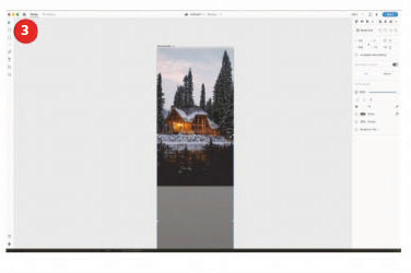
The Visual Web: Visual content is placed at the forefront of this online magazine, to keep the presence extremely similar to the print edition of the magazine. This shows how far the web has come as a design medium, with rich magazine design becoming more easily created for the web.


One Page Wonder: “The print emulation of this website’s design is created to be as easy-to-read as possible, so there is really only one way to read and that is to scroll down through the content, like you would read through a magazine. Being a digital version, there is a handy inclusion of a contents page that can enable the reader to jump to any spread of pages.”

Earlier this year, Jason Binn decided to create a new luxury, lifestyle, and fashion website to showcase DuJour magazine (www.dujour.com). To do this, he combined print magazine design quality, with an adaptive web publishing model.

To accomplish this feat, Binn approached Code and Theory to develop a digital experience that could function flawlessly on desktops and tablets alike, while showcasing ongoing editorial updates and the full run of current issues.

Working side-by-side they embarked on designing a full digital experience on the web as the irst print issue of DuJour was being created. To do this well, simplicity was key. The online magazine exists as one long scrolling page with the relevant content loaded at the appropriate time.

#1 - INSPIRATION: Unified Publishing
Rather than creating separate experiences for the print and digital magazine, iPad, and website, Code and Theory developed a single-view site that houses editorial, advertising, and photo galleries. To ensure navigating the site was a seamless experience, Code and Theory designed an infinite scroll format that allowed for undisrupted exploration and keeps users on the same single webpage. Users can browse through photo stories, dive deep into editorial content or just scroll through highlighted stories one after another. Each individual piece of content is shareable to a variety of social media through deep links.

#2 - TECHNIQUE: Sliding Side Panel
STEP 1: Create The Panel
Create a new HTML page, and in the body, section add the div tags as shown below. This is the panel that will slide in from the side and the switch that will be pressed to make the panel slide in and out from the right-hand edge. The switch has a less-than symbol displayed as an arrow, but you could use an image icon.

CODE:
<div id="panel">Panel</div>
<div id="switch">&lt;</div>

STEP 2: Style The Document
Move up to the head section of the document and add the link to jQuery and the style tag. Add the CSS rule for the body and HTML that sets the margin and padding to 0, with the height of the document set to 100% which enables the panel to also be 100%. The overlow is set to hidden to avoid having horizontal scroll bars.

CODE:
<script src="http://code.jquery.com/jquery-latest.min.js"></script>
<style type="text/css">
body, html {
margin: 0; padding: 0;height: 100%; overflow: hidden;
}

STEP 3: Style The Document (2)
Continue styling the page by making the panel a mid grey colour, it will be the full height of the browser and 400px wide. The position will be o the screen to the right. The switch that controls the sliding panel is made to have a yellow background and also positioned to the right, but halfway down the document.

CODE:
#panel {
background-color: #999; width:400px;
height: 100%; position:absolute;
top: 0; right: -400px;
}
#switch {
background-color: #FF0; position:absolute;
top: 50%; right: 0;
cursor: pointer;
}

STEP 4: Add The jQuery
Still in the head section, add the script tag and the remaining jQuery code – this adds a variable that tells us whether the side panel is on the screen or not. The document-ready function allows jQuery to add a click function to the switch when it loads. If the on-screen variable is true then the panel is slid of to the right.

CODE:
<script>
var onScreen = false;
$(document).ready(function() {
$("#switch").click(function() {
if (onScreen){
$("#panel").animate({'right':'-400'},'easeOutSine');
$('#switch').text('<');
onScreen = false;
}

STEP 5: Add To Your CSS
If the panel is not on the screen it is slid on, using this code. Notice that the text in the switch div tag is changed to a greater-than symbol (>). This shows that the switch now controls the side panel to slide back out. Save this and test it in the browser to see the sliding side panel on the right of the screen.

CODE:
else {
$("#panel").animate({'right':'0'}, 'easeOutSine');
$('#switch').text('>');
onScreen = true;
}
});
});

#3 - TECHNIQUE: Recreating The Logo
The online magazine uses a classic title-based logo, often seen in print, and here we show you how to leverage the power of Illustrator to recreate the logo by manipulating the letterforms.

STEP 1: Add The Text
Open Adobe Illustrator or a similar tool and use the Text tool to add the title as shown. We’ve used Bodoni as the typeface and changed the ‘Jour’ part to bold, so there is a slight difference in the emphasis.
STEP 1: Add The Text


STEP 2: Convert To Paths
Select the text, and from the type, the menu chooses to Create Outlines. The text is not editable as text now but editable as a vector shape. Switch to the direct selection tool, which is the white pointer tool, ready to manipulate the text.
STEP 2: Convert To Paths


STEP 3: Manipulate The Letter
Click and drag around the bottom half of the letter J. Now click and move this down and to the right to create the letter as shown in the screenshot. You can also move the letter closer to the others after you have finished manipulating it.
STEP 3: Manipulate The Letter

Digital First For DuJour Magazine Digital First For DuJour Magazine Reviewed by Kamal Thakur on Saturday, September 19, 2020 Rating: 5

Scrolling Backgrounds With An Animated Twist

Friday, September 18, 2020
 
Scrolling Backgrounds With An Animated Twist
Tone It Down: Reducing the colour in the background achieves two things. Firstly it cuts down on data so an image can be compressed further. Secondly, it allows the main content to be read much more clearly over the top without the backdrop muscling in on the foreground.


“The moving image in the background of the Diva website works so successfully because the user isn’t accustomed to the background changing too much. In order to improve user experience think about how visitors interact with your site and what might be altered to give your users a more memorable experience – this is certain to drive traffic.”

Inspiration: www.divabymakole.at

There are so many examples of websites out there that have a good design, but not always a boundary-pushing user experience.

Occasionally, though, you will come across a website that offers a real wow factor as you explore it, providing some form of graphical awesomeness out of the blue.

When good design and interactivity are brought together you get a very memorable site. The Diva website has an incredibly simple design on first impressions. There’s a model in the background and the content is deliberately placed towards the bottom of the screen inviting you to scroll. As the user moves down the page, however, the background image comes alive as a sequence of images reveals the model getting dressed, with the content sliding over the top. All in all, it makes for a fun and unexpected experience.

#1 - INSPIRATION: Simplicity Is Key
So often a website will try and cram far too much detail in, with sidebars and content all over the place. The Diva website keeps its content relatively simple, in a single column for the majority of the page. This enhances the background image content and makes it easy to scale for smaller devices. The design has suitably been thought through when moving to tablet-style displays, as the menu moves from the side to the top. Again, when moving to a smaller phone-sized display, the background image becomes fixed saving the browser the extra workload of dealing with those images.

#2 - TECHNIQUE: Scroll-Driven Animated Images
STEP 1: Start The Document
Open a new HTML document and add the code below into the head section. This links up to the jQuery library and establishes the main structure of the page.

CODE:
<script src="http://code.jquery.com/jquery-1.7.2.min.js"></script>
<style type="text/css">
body{
margin: 0;
height: 1800px;
min-height: 1800px;
padding: 0;

STEP 2: Complete The CSS
In the head continue adding the CSS as shown. This styles the image swap div area and allows it to fill the full screen. We create a fixed class that we add with jQuery then we add a class for each image. Continue adding classes for 3 and 4; these will be the same as 2 but with a higher z-index, positioning images correctly.

CODE:
imageSwap{
position: fixed;
overflow:hidden;
top: 0px;
left: 0px; width:100%;
}
#imageSwap.fixed {
position: fixed;
top:0 px;
}
.1 {
position:absolute;
z-index:1;
}
.2 {
position:absolute;
display:none;
z-index:2;
}
</style>

STEP 3: Add The Body Content
Move to the body section now. The following code adds a div tag to the document that contains a series of images. The CSS turns the visibility of all the images of except for the topmost (image 1). Using jQuery we will activate the appropriate image as the user scrolls.

CODE:
<div id="imageSwap">
<img class="1" src="1.jpg" />
<img class="2" src="2.jpg" />
<img class="3" src="3.jpg" />
<img class="4" src="4.jpg" />

STEP 4: Add the jQuery
Now, underneath the div tag in the body section, add the following code which defines a JavaScript area and records the position of the scrolling. As the user moves down the document the scroll position is saved in the yPos variable. This then changes the position variable for every 300 pixels that are scrolled.

CODE:
<script language="javascript" type="text/javascript">
var thisPos=1;
var lastPos=1;
$(document).ready(function () {
$('#imageSwap').addClass('fixed');
$(window).scroll(function() {
var yPos = $(window).scrollTop();
if (yPos <= 300){
thisPos=1
}
if (yPos > 300 && yPos < 599){
thisPos=2;
}

STEP 5: Switch The Images
To give the illusion the background is moving, the images in the div tag are switched between. This is done by fading in the new position class and fading out the old position. The last position variable is updated after every scroll so we know where the user is in the document.

CODE:
if (yPos > 600 && yPos < 899){thisPos=3;
}
if (yPos > 900 ){
thisPos=4;
}
if(thisPos != lastPos){
$('.'+thisPos).fadeIn(10);
$('.'+lastPos).fadeOut(10);
}
lastPos=thisPos;
});
});

#3 - TECHNIQUE: Create Your Own Image Sequence
In order to create an image sequence background like Diva, you will need to set up a DSLR and capture your subject. Ideally, you would do this in a studio, but a well-lit room with a decent flash can work just as well.

STEP 1: Set Up The Shot
You need a steady shot so grab a camera and you will definitely need a tripod. If you haven’t got a floor-mounted tripod then a GoPro or mini tripod will suffice. Use a plain white sheet for the background.
STEP 1: Set Up The Shot
STEP 1: Set Up The Shot

STEP 2: Import into Photoshop
Once you have captured your subject bring the first image into Photoshop and add a new layer. Use a Radial gradient with the foreground set to white and the background set to black, then drag from the centre out to apply a vignette. Lastly, change this layer’s blend mode to Multiply.
STEP 2: Import into Photoshop
STEP 2: Import into Photoshop

STEP 3: Colour Tweaks
Press Cmd/Ctrl+U to call up the Hue/Saturation panel and drag the Saturation slider down to take some colour out of the image. Save the file and drag in the other shots, using this as a template.
STEP 3: Colour Tweaks
STEP 3: Colour Tweaks

Scrolling Backgrounds With An Animated Twist Scrolling Backgrounds With An Animated Twist Reviewed by Kamal Thakur on Friday, September 18, 2020 Rating: 5

Build Prototypes With Adobe XD

Sunday, March 24, 2019
Build Prototypes With Adobe XD

DOWNLOAD

Design seamless transitions between screens using 'Auto-Animate' and control it with your voice in Adobe XD

In contemporary web and app design there are often times when the interaction doesn’t open a whole new page or screen. The modern approach to creating interactive content requires transitions between design interface elements so that the user is surprised and wowed by the experience of changing content. This all happens on the same screen or page, without a refresh. Designing these kinds of interactions and refining them to work properly can take time, but it’s worth doing before writing your code.

This is what Adobe XD has spent the last few months of development getting right. Create content in one state on one screen, move that content to the new state on the new screen and simply choose the 'Auto-Animate' option to transition. All the content that is the same on both screens automatically animates from one position to another. If you don’t want all the content visible on both screens, make the content invisible on the first and it will transition into place.

Going beyond that, a new feature of XD enables the user to control interactions with their voice. We’ll explore this as a design feature and how the app can speak back to the user as well, which can provide some interesting design opportunities.

STEP 1: Starting The Project
If you don’t have Adobe XD, you can download and install it from adobe.com/ca/products/xd.html. Once the install has completed, open the software and the welcome screen will enable you to choose a screen size to download for. In this case choose the iPhone 6/7/8, as that’s the right size for this project, but you will see there are a variety of sizes available.


STEP 2: Import The First Image
There are different ways to import images, but in this first instance go to File>Import. Choose the 'assets' folder from the project files and the first image to import will be 'sky.png'. Place it on the top of the screen and move it a just couple of pixels down.


STEP 3: Place The Cabin
The next image for the design will be the 'cabin.png'. Just import this in the same way you did in the previous step and then place it to fill the screen. Finally, import the image 'trees.png' and place it at the bottom of the screen with the trees over the lake.


STEP 4: Bring In The Logo
The reason those images are separate layers is so that when a transition is created between screens they can move separately. Go to the File menu and choose Import. This time select 'logo.ai', which is a vector image. Place this image in the top centre of the screen.

STEP 5: Add A Circle
Select the circle tool and draw a circle just slightly larger than the logo. In the Properties panel on the right, remove the stroke and make the background black. Select Background blur and reduce the brightness to -30 so that the circle is still black.


Hidden Panels:
The Asset panel and the Layer panel are available from the bottom left of the XD Interface. These enable you to store asset styles and rename or reorder layers.

STEP 6: Reorder The Graphics
Now the circle needs to move behind the logo. Select Object>Arrange and send backwards. Like in other Adobe products, it is also Cmd/Ctrl+[ to move any graphic backwards in the layer order. Using the right square bracket, meanwhile, will bring an object forwards in the order.


STEP 7: Drop Themic
Now import the 'mic.ai' image and resize the image to be relatively small. Place this at the bottom of the screen. Draw a circle around this and uncheck the fill so that it’s removed. Then make the stroke white and two pixels wide. Position that around the 'mic' image.


STEP 8: Text Message
Use the text tool to add the words 'speak to search' below the microphone. Make the text white and change it to Helvetica Neue Condensed Black. In the bottom left of the screen click the Assets panel icon to open it. With the text selected on the screen, click the ‘+’ icon next to ‘Character styles’ to save this format for the text.

STEP 9: Join A Group
Select the Layer panel icon in the bottom left of the screen. On the screen, select the 'search' text and Shift-click to add the circle and the mic icon. Go to Object and choose Group. In the Layer panel rename this group 'Search'. It’s useful to name groups, especially when animating these.

STEP 10: Group The Logo
Just as in the last step, select the logo and the blurred circle around it, then group them together. In the Layer panel, rename the whole group 'logo' so that it is easily identifiable if you need to edit this again later. For the moment the design for the first screen is complete.


STEP 11: Extra Elements
Even though the first screen is complete there are still more design elements that need to be added. This is how animation is created by changing the elements’ positioning between screens. Go to the rectangle tool and hold Shift to add a square on the screen, making the border white.


STEP 12: Different Import
Now open the folder for the assets through your operating system. Select the ‘cabin1.png’ image and drag this directly onto the square that you created in the previous step. It will automatically be masked inside this. Double click to edit the position of the image and make sure that the cabin is visible in the square.


Different Modes:
There are two different modes in Adobe XD; the design view that allows you to lay out your screens, and the prototype view, which enables you to wire up the interactions.

STEP 13: Add A Label
Using the Text tool, add the label 'Forest Cabin' below the text and use the Assets panel to style the text in the saved style from step 8. Select the image and the label and group them together. Name the group 'left cabin' in the layers panel.


STEP 14: Duplicate The Group
Normally repeating an interface element is the perfect job for the 'Repeat Grid' tool. However, this is going to need specific animation, which doesn’t work with the Repeat Grid. Select the image and text group, then copy and paste it so that it sits next to the original, and add the image 'cabin2.png' instead.


STEP 15: Rename Then Copy Again
Change the text to 'Snow Cabin', and in the layers panel name this 'right cabin'. Select both the left and right cabin and duplicate them, position the duplicates below and update their text and images with 'cabin3.png' and 'cabin4.png'. Group both of these together and name the group 'lower cabin'.


Working With Responsive Design:
If you are designing web pages then it’s always difficult to design for different screen sizes. Adobe XD understands that designing modern web pagesmeans designing for different screens. By default the Responsive Resize option is turned off for an artboard. Turn this on when you want to resize your artboard. It’s usually a good idea to make a copy first for the differentsized screen. XD does a pretty good job of resizing your content, but if anything doesn’t stay together that should then simply group those elements. After resizing, you canmanually adjust anything that isn’t to your liking, whichmakes it much faster thanmost other design programs to convert a design from screen to screen.

STEP 16: Text Title
Add text to the page with the text 'Search results for cabins'. Give this the Rockwell typeface and save this to the Character Styles in the Assets panel. Now position the 'lower cabin' group right at the bottom of the screen and take the appearance down to zero so that it is invisible on this screen.


STEP 17: Changing Opacity
Now select the left and right cabins, move them to the bottom of the screen and take the appearance slider to zero. Repeat again for the search text. When we move to another screen these will all animate to their new positions. In the Layer panel, move the 'left cabin' above all of the other cabin groups.


STEP 18: Duplicate The Screen
Select the artboard by clicking on its name, then double click the artboard and change the name to 'home'. Copy and paste the artboard and rename it 'search'. Now select the logo and move it up to almost off the screen, then reduce its appearance to zero.


STEP 19: Move The Backgrounds
Select the sky image and nudge it up slightly on the screen. Select the cabin image and move it up until the cabin is at the top of the screen. Then click on the trees image and move it over the cabin. Finally, select the ‘search’ group and reduce the appearance down to zero.


STEP 20: New Elements Appear
Select the search results in the Layer panel and bring its appearance up to 100. Move it up on the screen. Repeat this for the left cabin, right cabin and lower cabin. Use the pen tool to draw a simple back button and add a circle around it. Make the background blur and take the brightness of that down to -30.


STEP 21: Complete The Back Button
Select the back arrow and circle, group them together and name them 'back button' in the Layer panel. Switch over to the 'Prototype' mode by pressing 'Prototype' in the top left of the XD interface. Select the homescreen, drag the blue arrow to the search screen and a pop-up panel will appear.

STEP 22: Voice Command
Change the Trigger to Voice and type the word 'search' as the voice command to control this. Change the Action to Auto-Animate and Easing to Snap. Make the duration 1.5s. In the search screen click on the back button and drag the blue arrow back to the 'home' screen. Just change the Trigger to Tap.


STEP 23: Test The Prototype
Over in the top right of the XD interface is a play button. Click on this and a working prototype will now pop up on the screen. On the homepage you will need to hold down the Space-bar while you speak the voice command 'search'. When you let go of the Space-bar it will take you to the next screen and animate the graphic interface into position.


STEP 24: Going Back
Once the transition has run you can press the back button to get back to the homescreen. Close the prototype and click on the search screen, then click the blue arrow to the right (don’t drag). Change the Trigger to Time, make the delay 0s and set the Action to Speech Playback. Make the speech 'search results for available cabins'.


STEP 25: Speech Confirmation
Test this now with the play button to hear a voice confirmation of the search. Close the prototype when you have tried this out. Another screen is going to be created, so let’s click back on the 'Design' view in the top left of the XD interface. Click on the search screen by clicking the name, and then copy and paste it.


STEP 26: Scaling The Image
Rename the new screen 'cabin'. Double click the image for the 'left cabin' layer. Resize the corner handles so that it fills the screen, then reposition the image inside so that it covers that screen. Click on the search results text and take the appearance down to zero to remove it from view.


Test On A Device:
Your final testing of the app is not just limited to testing on the desktop – your prototype can also be tested on a device to get the right kind of feel for how it will look on the device. First of all, download the Adobe XD app fromyour device’s respective app store, then connect the device to the computer with a USB cable.

Click on the small mobile phone icon in the top right of the XD interface. In the panel that pops out you should be able to see the name of the device and, provided you have the XD app running on that device, youwill be able to see and test prototypes. It’s also possible to avoid using a USB cable and transfer via the Creative Cloud.

STEP 27: New Screen Elements
Double click the 'Forest Cabin' text as it is part of the group. Enlarge the text size to 26 pixels and move it up slightly on the screen. Add text to the screen in Helvetica Neue Medium at 14 pixels size and set it to white to stand out against the background. Add a white line with the line tool under the heading.


STEP 28: Create A Button
Use the Rectangle tool to draw a rectangle on the screen at the bottom of the design. Drag in the corner handles to give this shape round corners. Add the word 'Reserve' to this, using the saved character style in the Assets panel for Helvetica Neue in Condensed Bold.


STEP 29: Move To Prototype Mode
All the design elements are in place now for the entire design of the app. Move to the 'Prototype' Mode by clicking the word 'Prototype' in the top left corner. In the search screen click on the 'forest cabin' group of the image and text. Drag the blue handle from this over to the 'cabin' screen.


Repeat Grid:
Often when designing interface elements there are a number of repeating items, so be sure to use 'Repeat Grid' for these.

STEP 30: Animation Settings
In the pop-up panel for the transition between screens, choose Tap as the Trigger, then make Action Auto-Animate. Keep Easing as Snap but reduce the duration of this to 0.6s. This ensures that the animation doesn’t drag – the movement of the first screen to the second screen had a lot of movement that required a longer transition.


STEP 31: Link Up The Back Button
Now select the back button from the final screen and drag the blue arrow from this back over to the 'search' screen. All the settings from the previous transition should be remembered. You are now ready to go ahead and test this by clicking on the play button.


STEP 32:  Auto-Animate
What you will see with the auto-animate now is that the image expands to fill the screen, and the elements that are no longer needed will fade away while the new text will fade in. The opposite happens when going back. This provides a good way to see the auto-animate working across three screens.


STEP 33: Save The Project
By default your project should automatically save to the Creative Cloud, but it is a good idea to save a copy to your own hard drive in case there are any issues. Click File>Save, change the location to your own computer and name the project with a suitable name.


STEP 34: Sharing The Project
The whole point of prototyping is to test the project on other people. Fortunately there is a share button on the top right of the XD interface that makes this a breeze. Click the share button, and in the dropmenu that appears select the option Share for Review.


STEP 35: Publish Prototype
In the next screen you are told that auto-animate support is not yet available for the web, but it is coming soon. Click Create Public Link and then click the link in the top right to visit the public link in a web browser. You will need to hold the Space-bar down to use the voice command with the prototype.


STEP 36: Video Version
Another prototype can be shared by recording the interface in action. Click the share button and choose Record Video. This will open a window, and when you close this you will be prompted to save a recording of the screen as an MP4 file, which is also a useful way to share your prototype.


DOWNLOAD
PDF | CODE
Build Prototypes With Adobe XD Build Prototypes With Adobe XD Reviewed by Kamal Thakur on Sunday, March 24, 2019 Rating: 5

Make An Animated Extending Menu

Sunday, March 24, 2019
Make An Animated Extending Menu
Use CSS and JavaScript to create content space and reveal navigation options. 

DOWNLOAD


STEP 1: Document Initiation
Start with the HTML document. This consists of the document container HTML tag, containing a head and body section. The head is used to reference the external CSS and JavaScript resources, and the body is used to contain the visible page content that will be created next.

CODE:
<!DOCTYPE html>
<html>
<head>
<title>Extending Menu</title>
<link href="styles.css" rel="stylesheet" type="text/css" />
<script src="code.js"></script>
<body>
*** STEP 2 HERE
</body>
</head>
</html>

STEP 2: Navigation Content
The example content consists of a navigation container that stores a collection of links. The only exception to this is the first element of the navigation container, which will be used as the interaction icon. Take note of how the navigation container has the 'extend' class applied – this will be used to identify that this navigation is to have the effect applied.

CODE:
<nav class="extend">
<span>+</span>
<a href="#">One</a>
<a href="#">Two</a>
<a href="#">Three</a>
<a href="#">Four</a>
</nav>

STEP 3: JavaScript - Link Management
Create a file called 'code.js'. This step searches for all of the links inside the navigation(s) using the 'extend' class. Each link found has an 'animationDelay' style applied, which is calculated in relation to its index position. As a result, any CSS animation applied to these links will appear in ascending order based on the link position. Note how this code is inside a 'load' event listener applied to the window.

CODE:
window.addEventListener("load", function(){
var time = 0;
var nodes = document.querySelectorAll
("nav.extend > a");
for(var i=0; i<nodes.length; i++){
nodes[i].style.animationDelay = time+"s";
time += 0.2;
}
*** STEP 4 HERE
});

STEP 4: JavaScript - Icon Management
A second search is also required by JavaScript. This time the focus is on finding the first child element inside the identified navigation containers. This element has a click event applied to toggle the application of the 'open' class to its parent element, the navigation container. As a result, CSS can be used to define specific styling based on whether the navigation is 'open' or not.

CODE:
var nodes = document.querySelectorAll("nav.
extend > *:first-child");
for(var i=0; i<nodes.length; i++){
nodes[i].addEventListener("click",function(){
this.parentNode.classList.toggle("open");
});
}

STEP 5: CSS - Navigation Icon
Create a new file called 'styles.css'. This step sets the appearance of the first child of nav elements using 'extend'. A bigger font size, along with inline-block display, enables it to be automatically positioned alongside the navigation links, but with the ability to be treated like a block. A transition is set to the transform property to enable step 7 to trigger an animation effect.

CODE:
nav.extend > *:first-child{
display: inline-block;
cursor: pointer;
user-select: none;
-moz-user-select: none;
transition: transform .5s;
font-size: 2em;
transform: rotate(0deg);
}

STEP 6: Navigation Links
Links inside the navigation container using the extend class also need styling. To be hidden by default they use relative positioning, so that animation can move them towards their natural text flow location. Horizontal spacing between links is achieved by using padding on each side, so that they are clearly distinguishable from each other.

CODE:
nav.extend > a{
display: none;
position: relative;
opacity: 0;
padding: 0 1em 0 1em;
text-decoration: none;
color: #777;}

STEP 7: Open States
JavaScript applies and removes the open class to the navigation icon that has been clicked. This class is used to specify presentation changes when the navigation is open. Firstly, on the icon a rotate transform is applied, which will appear animated due to the transition applied in step 5. Secondly, the navigation links are changed to display as an inline-block to become visible, along with the 'open' animation to control their appearance.

CODE:
nav.extend.open > *:first-child{
transform: rotate(45deg);
}
nav.extend.open > a{
display: inline-block;
animation: open 1s forwards;}

STEP 8: Open Animation Definition
The last step is to define the opening animation required for step 7. With links set to use relative positioning, this animation starts the navigation links two characters before their natural text flow position and animates them to where they should be. Opacity starts from invisible to fully visible, making each link appear into view as they animate.

CODE:
@keyframes open {
0% {left:-2em; opacity:0;}
100% {left:0; opacity:1;}
}

DOWNLOAD
PDF | CODE
Make An Animated Extending Menu Make An Animated Extending Menu Reviewed by Kamal Thakur on Sunday, March 24, 2019 Rating: 5
Powered by Blogger.